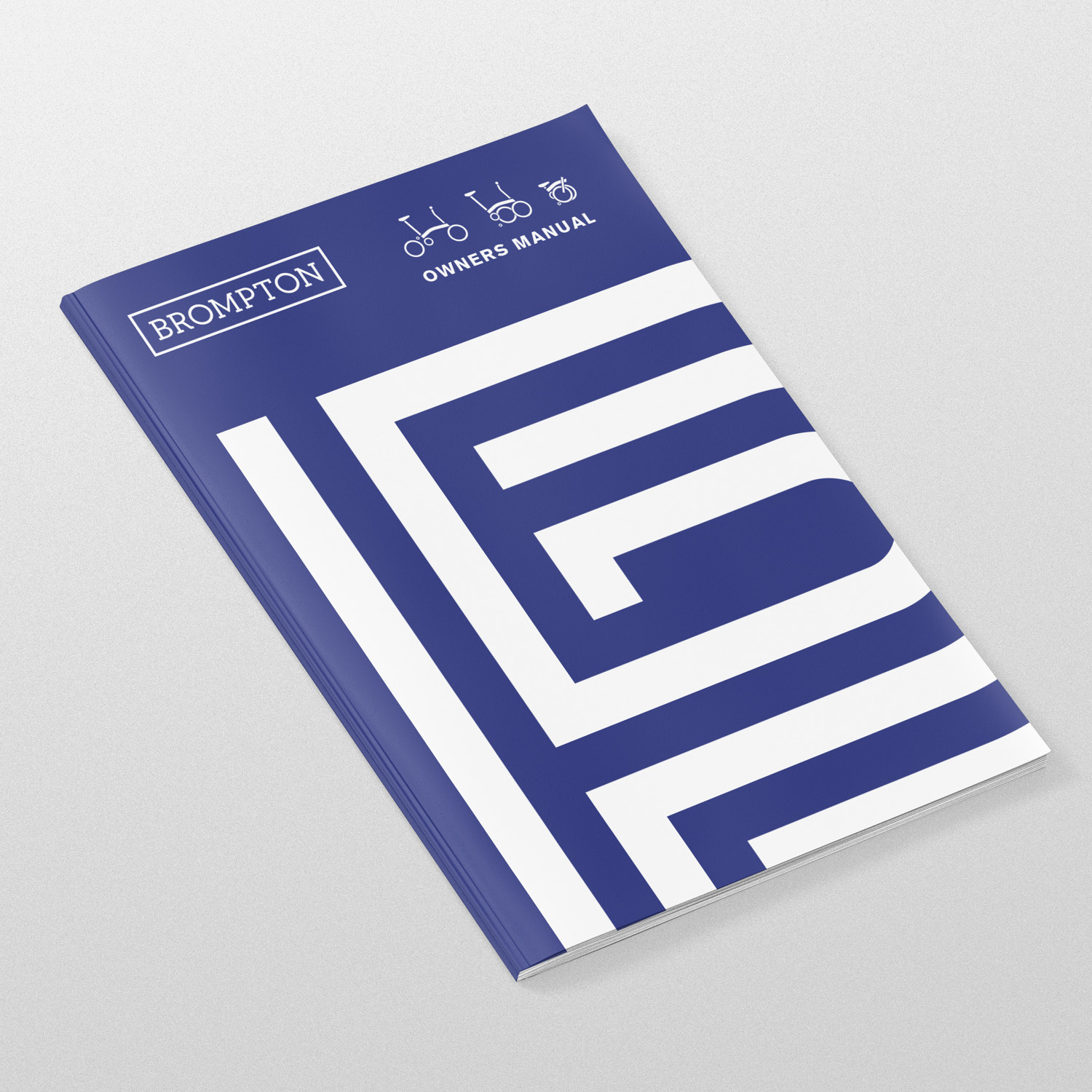
Brompton Lines
Logotypes
Strategy
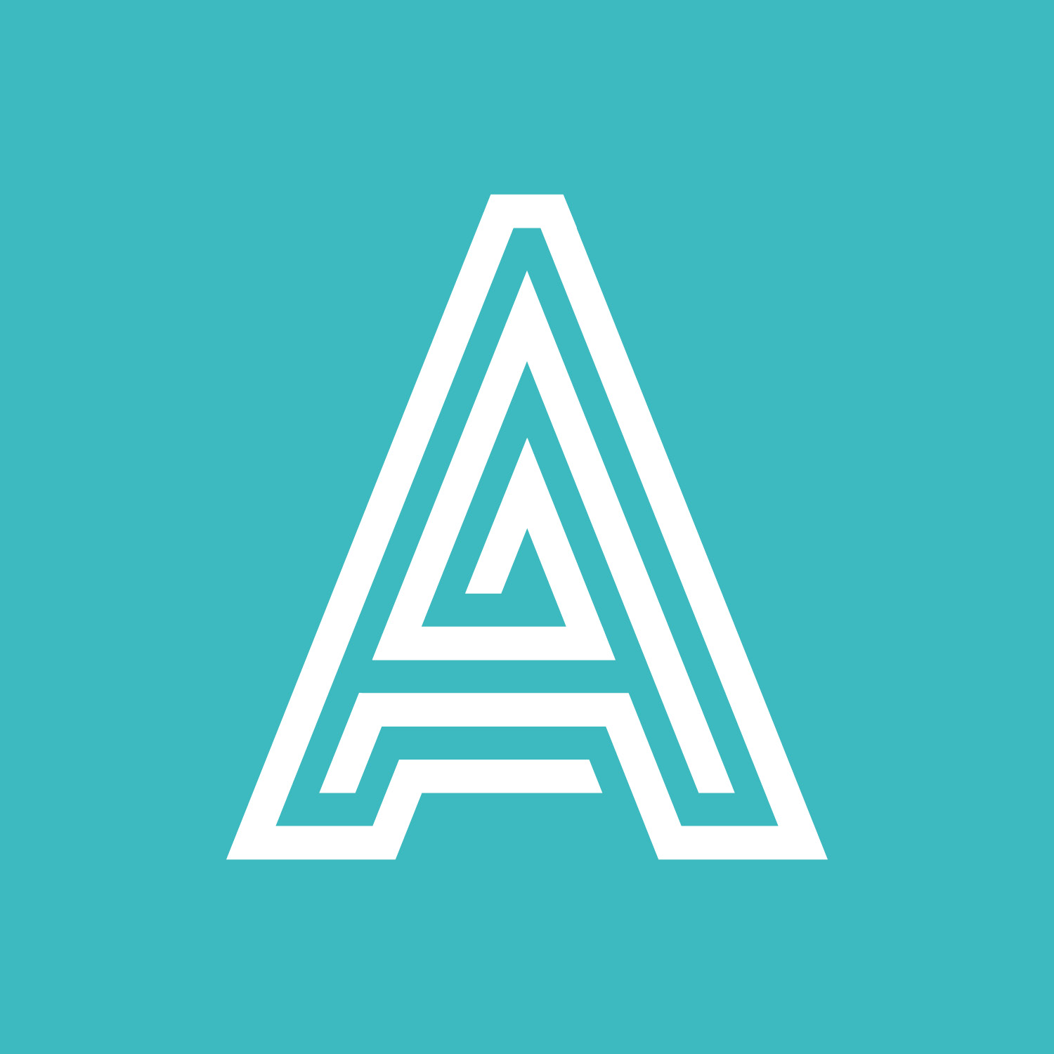
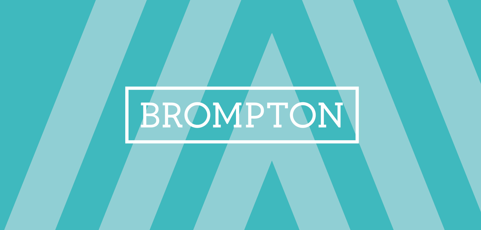
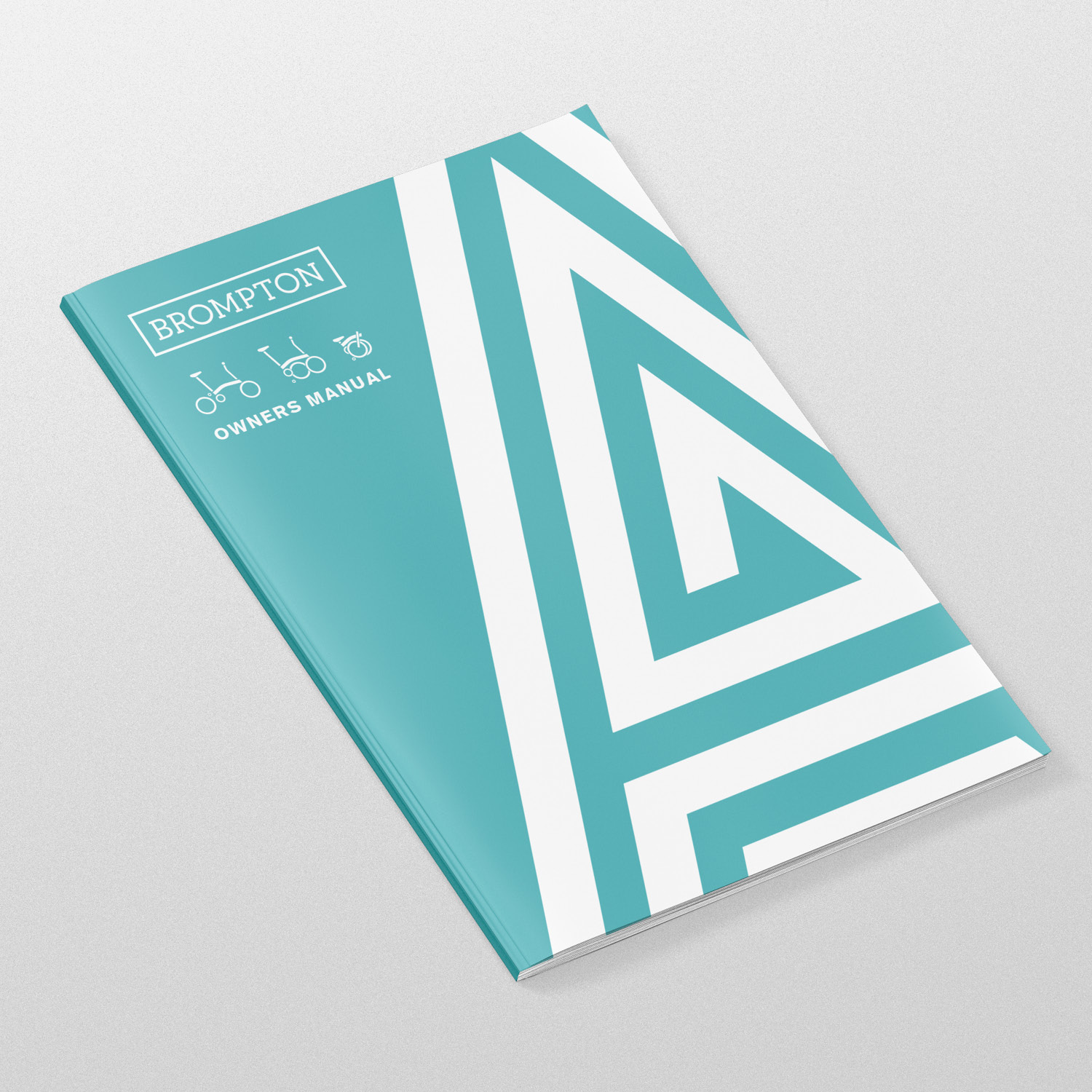
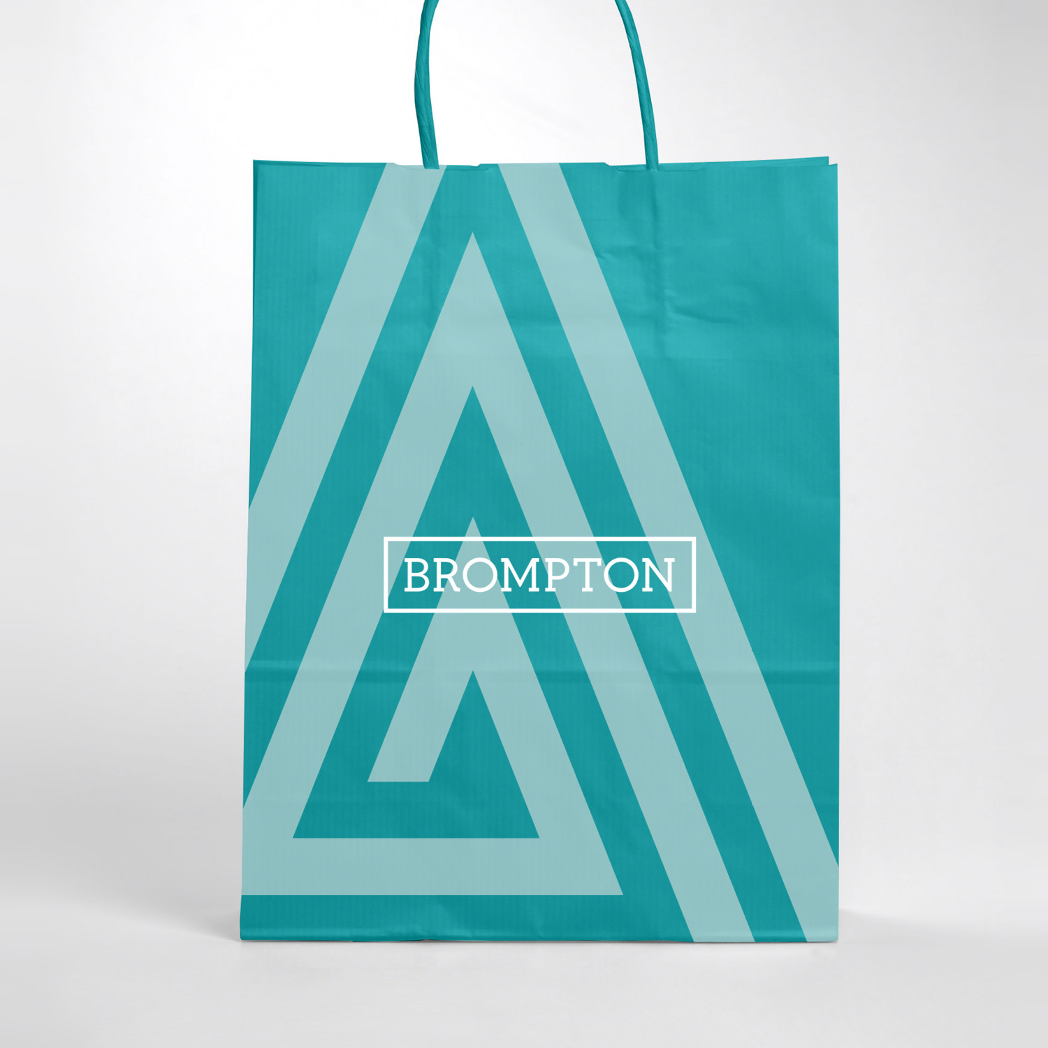
Brompton wanted to introduce a new identity and naming system for their bikes. I worked on the strategic positioning and naming of the new product line system, and designed logotypes for each line which feature on all of their bikes. Each logotype is made up of two graphic lines, which represent two synchronised journeys to create unique letterforms. Zooming and cropping into a section of the letterform creates a distinct and abstract visual world for each line. I designed this project at Antidote.
A Line
The A Line is Brompton’s entry-level model, designed to be essential and straightforward. It comes in a single colour option, and the teal we chose gives it a clean, simple feel without leaning too premium.
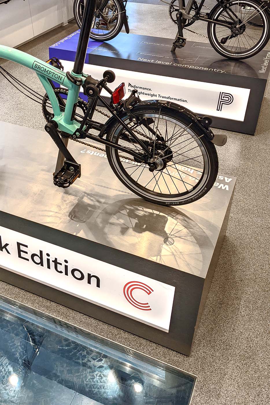
C Line
The C Line is Brompton’s mid-level model, offering seven different styles for a more personalised experience. It's the most customisable option, allowing customers to create a bike that truly reflects their personality. A vibrant red was chosen to highlight this individuality.
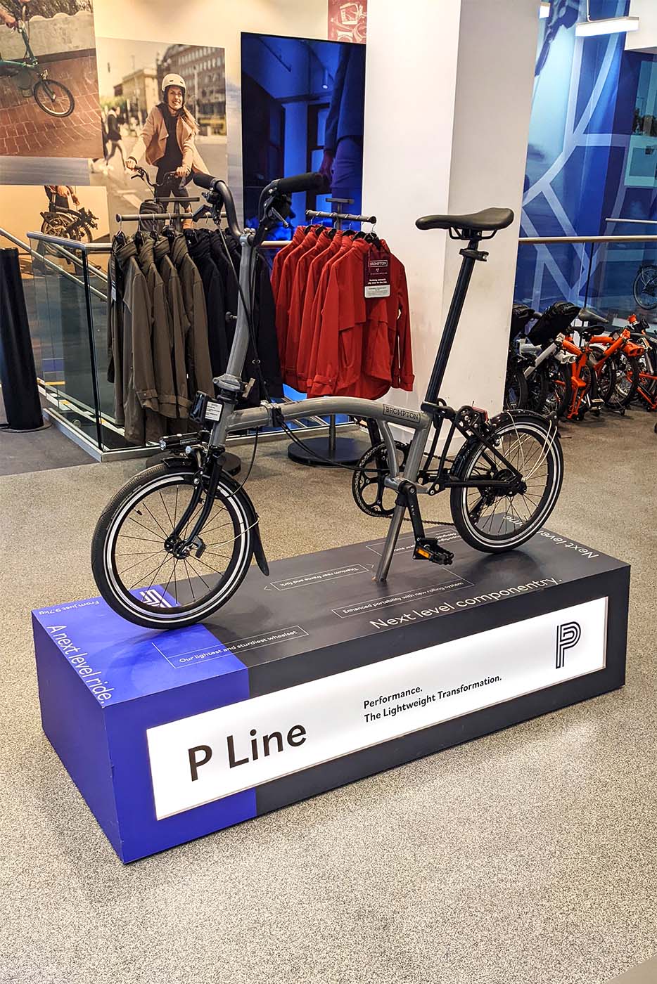
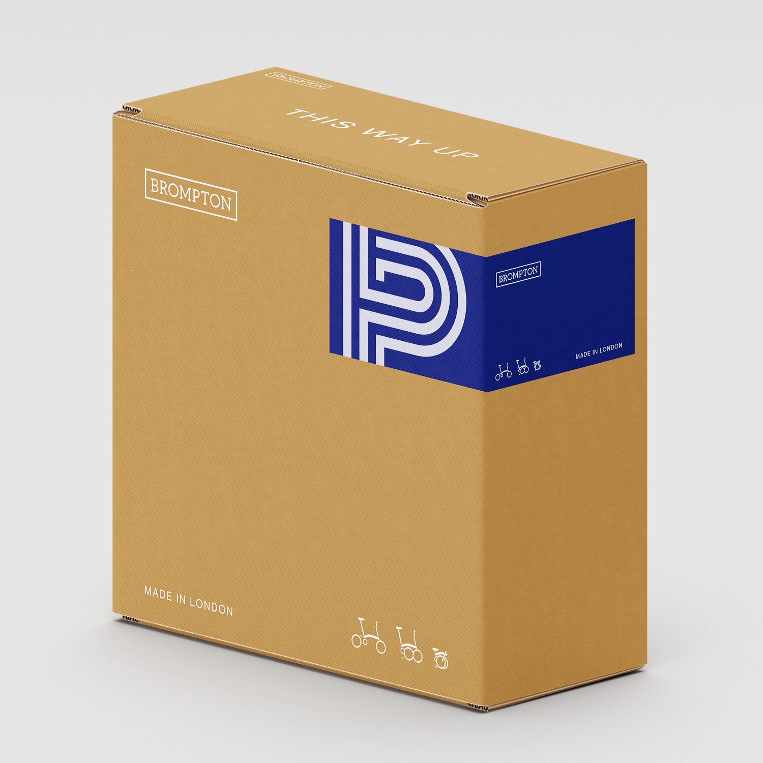
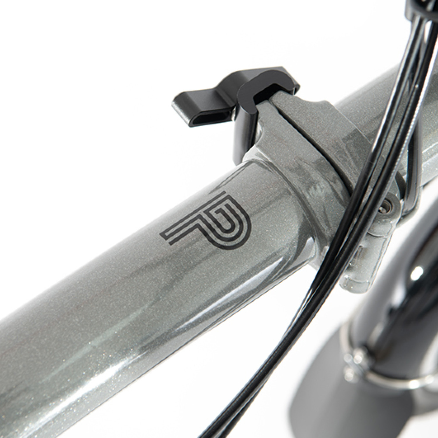
P-Line
The P Line is the upper-level Brompton, featuring a lightweight 4-speed titanium and steel frame. With sleek finishes, these bikes have a high-end appearance. Royal blue was chosen to categorise them, as it evokes a sense of luxury and exclusivity.
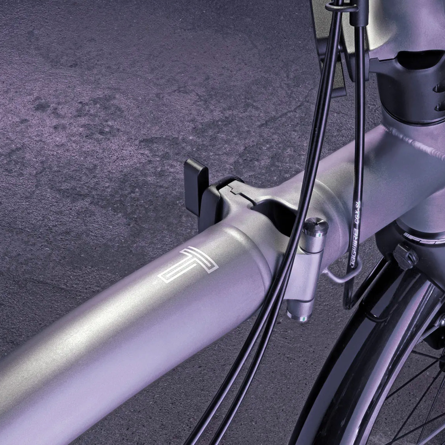
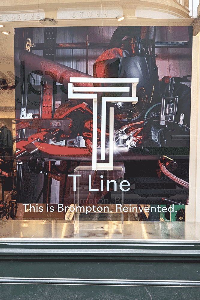
T Line
The T Line is Brompton’s highest-end model, crafted from titanium. It comes in a single colour, titanium, and the dark grey finish complements its premium, minimalist design.