JOM
Brand StrategyBrand Identity
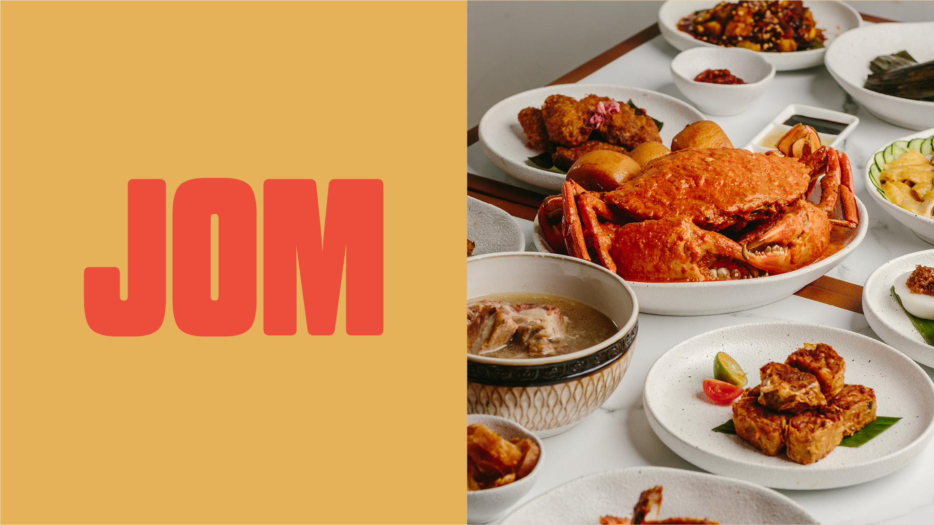
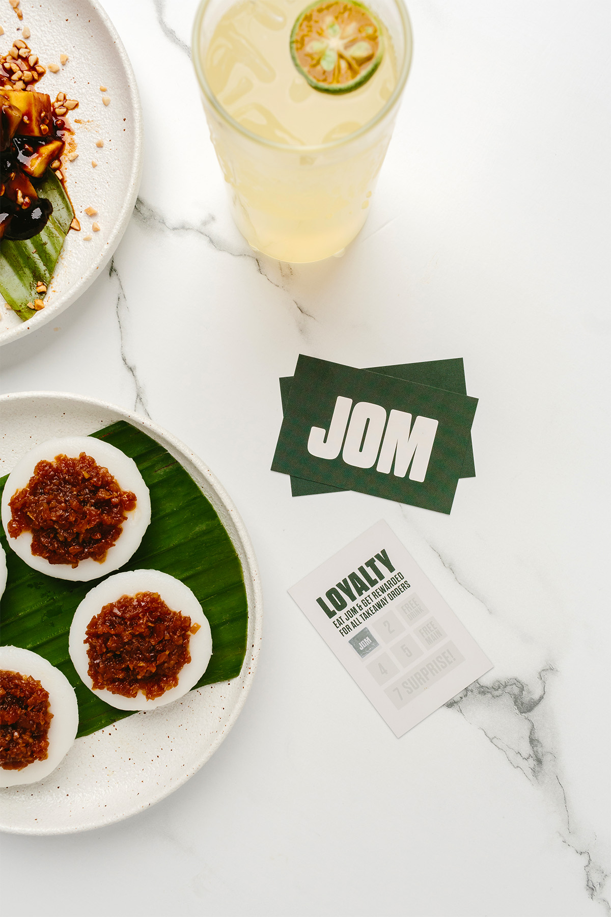
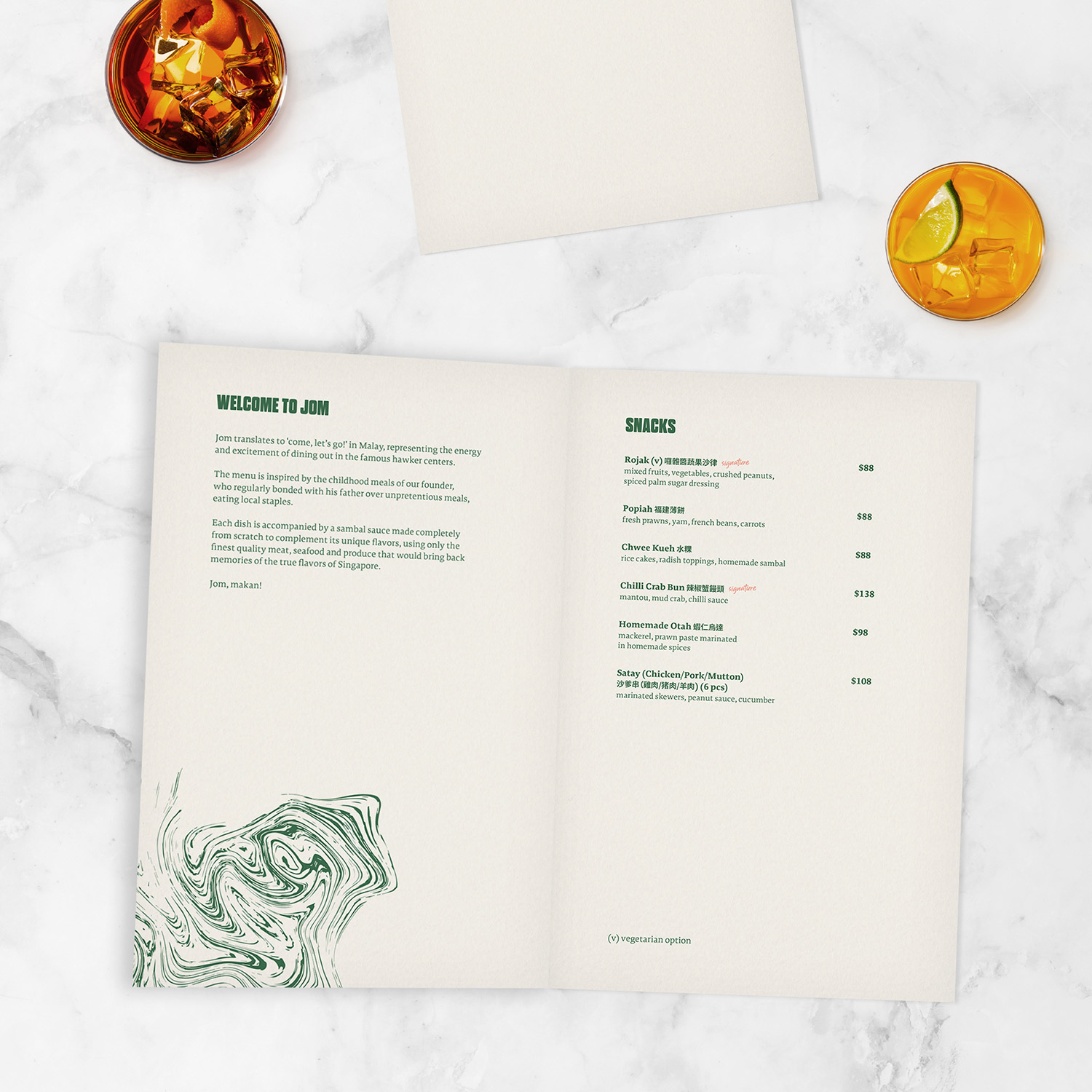
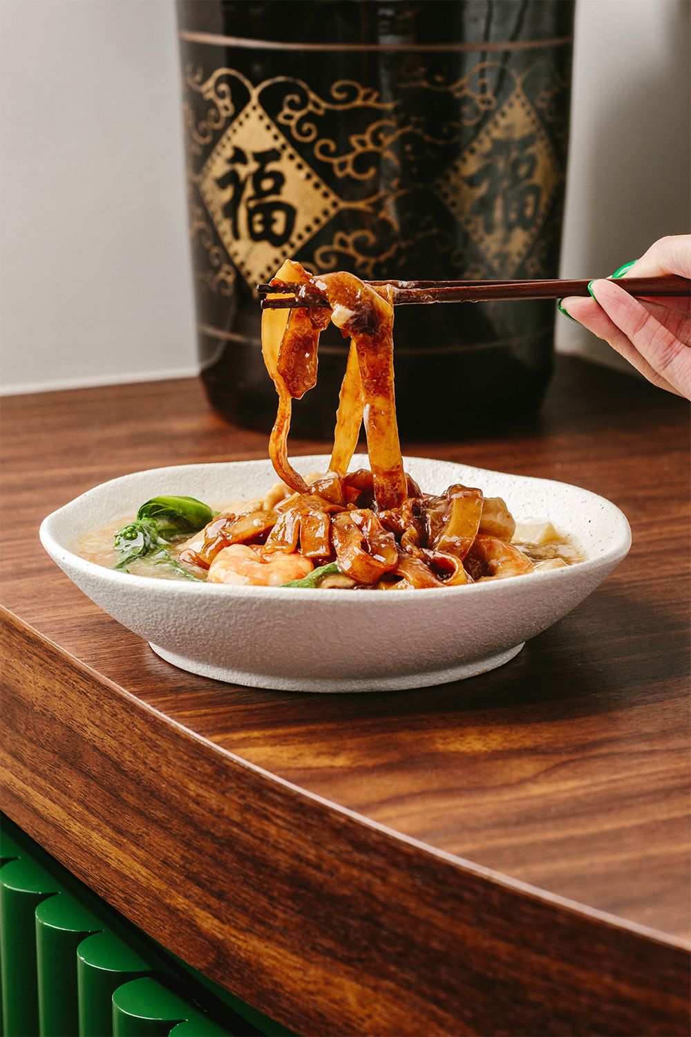
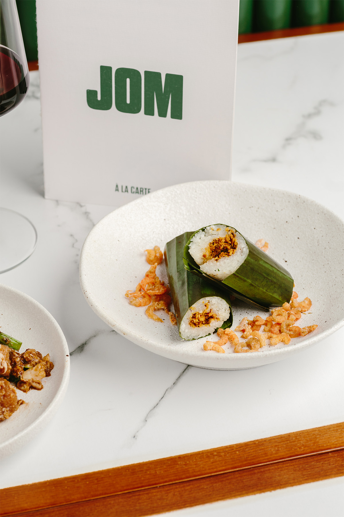
JOM is a newly opened restaurant in Hong Kong that pays tribute to the nostalgic foods and flavours of Singaporean cuisine. The name JOM is derived from the Malay phrase "come, let's go," which holds personal significance for the founder, symbolising cherished memories of dining with his father at local hawker stands during childhood. The menu at JOM features a wide variety of offerings, including small plates, meats, seafood, vegetables, noodles, and desserts, each a contemporary interpretation of classic dishes. Photography for the restaurant is by Sixteen Photo.


Brand Identity
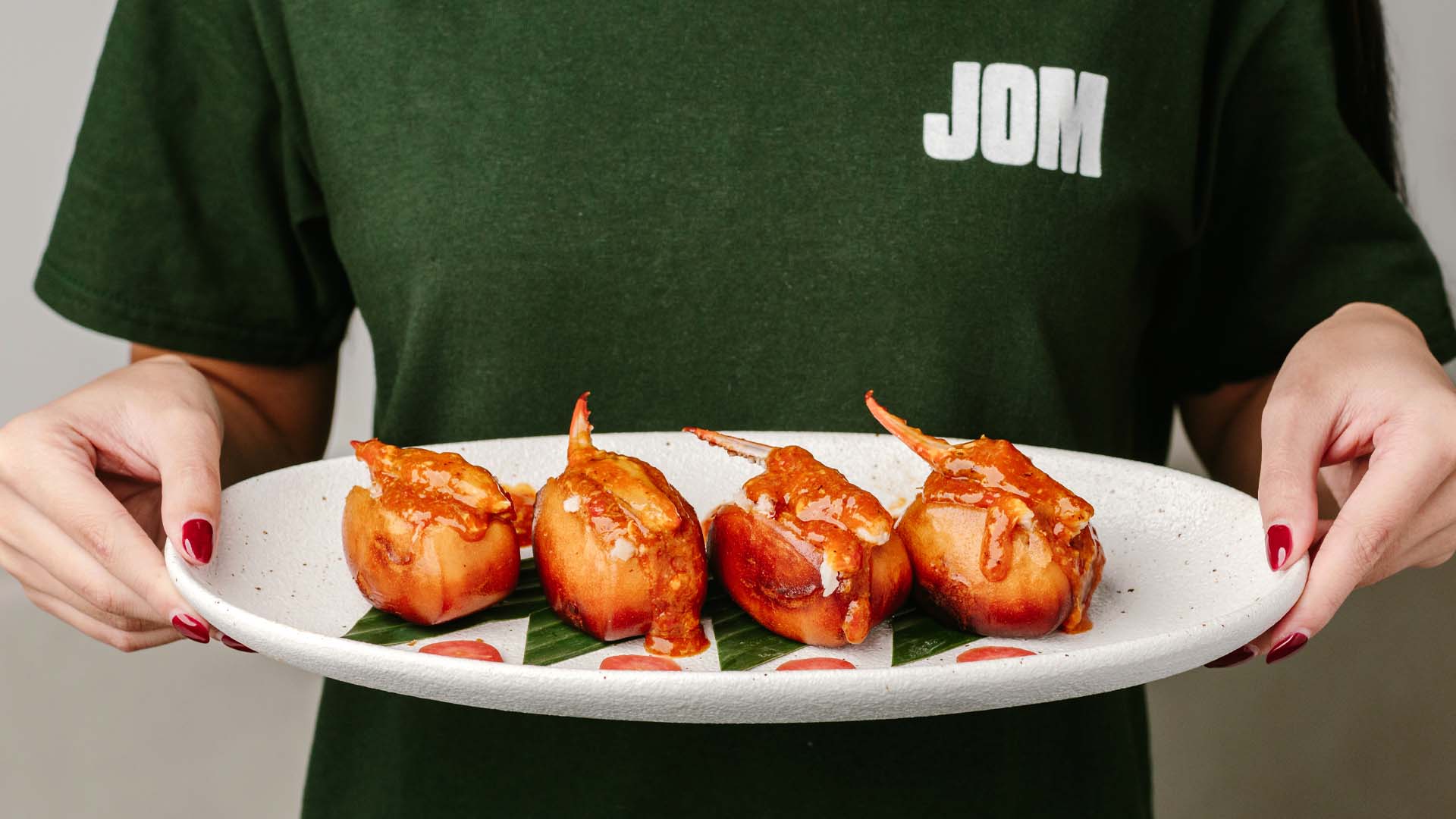
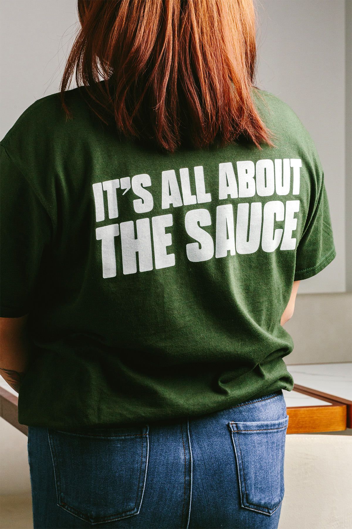
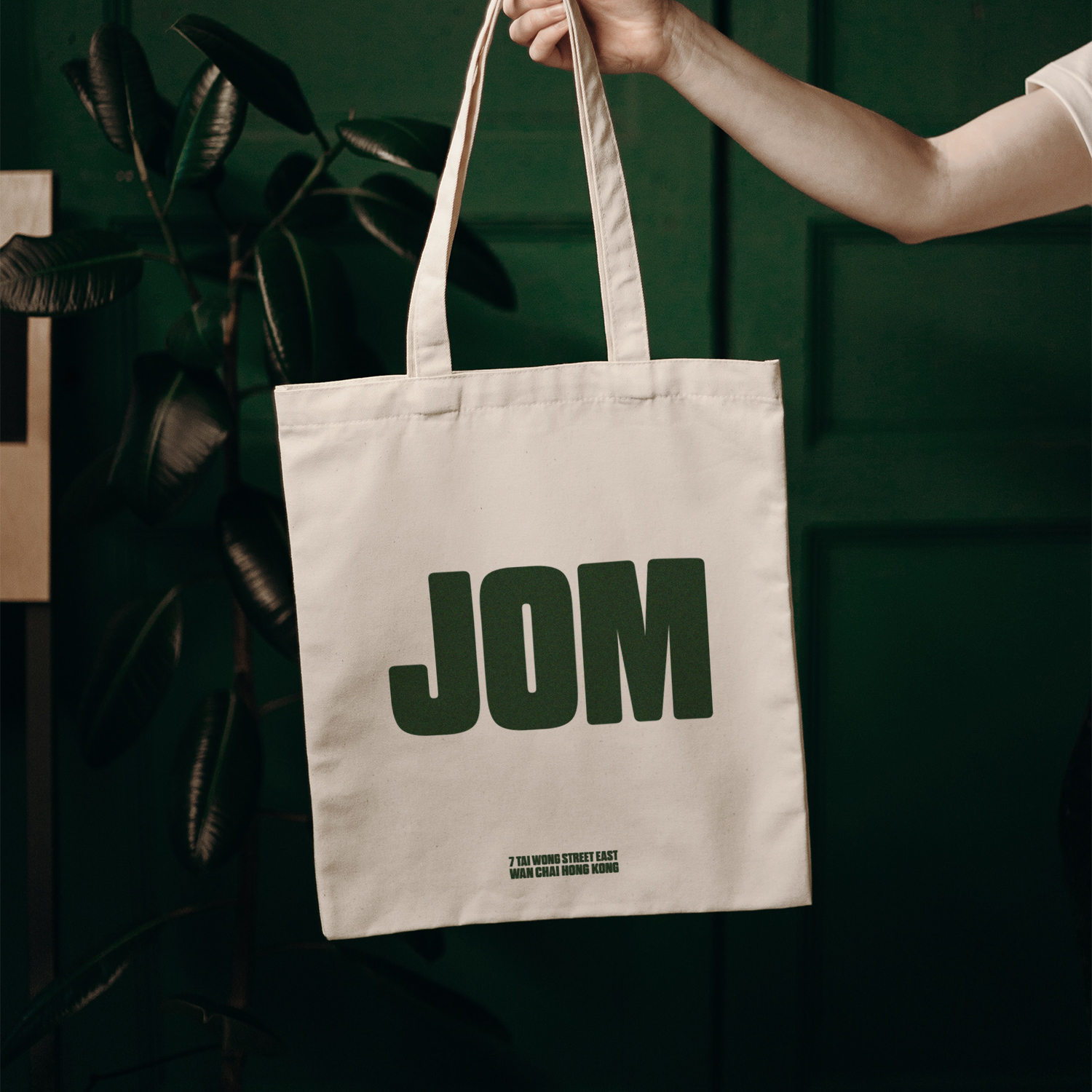
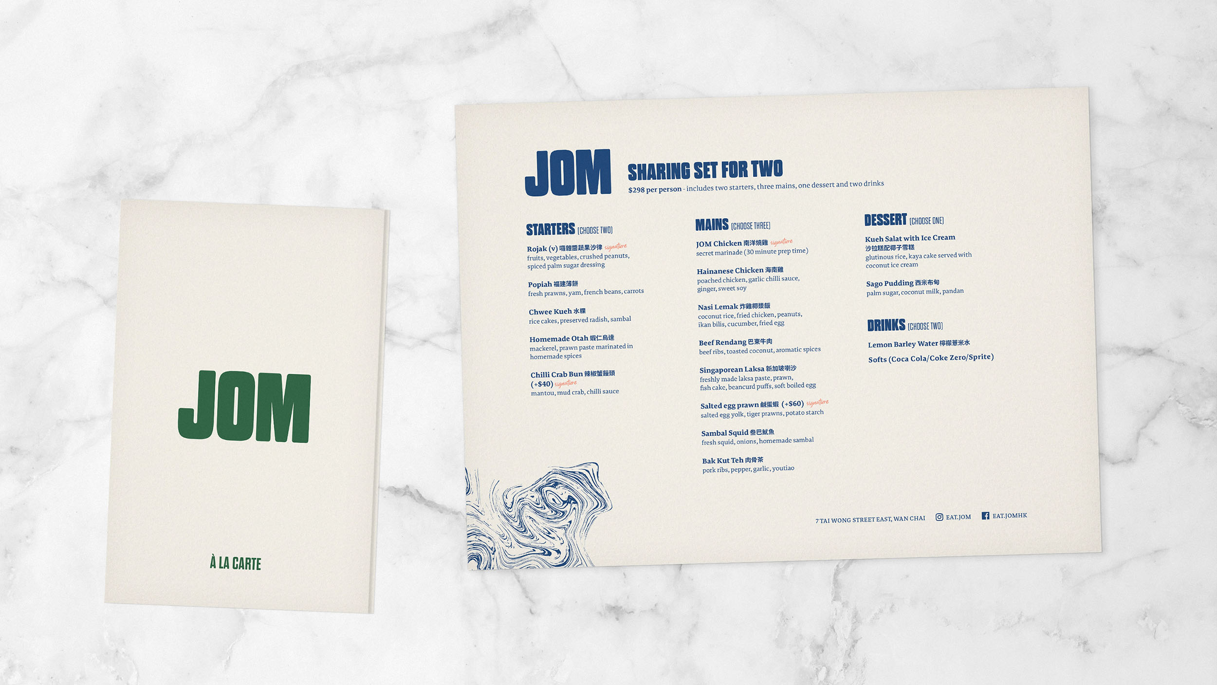
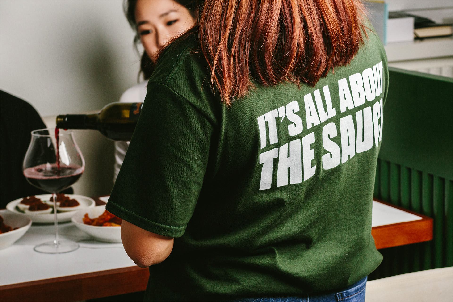
I developed JOM's brand identity around three key components – impactful typography, concise messaging, and a versatile colour palette – all inspired by its hawker centre roots. The headline typography is bold and striking, with curved edges adding softness to the letterforms. The copy is direct and to the point, reflecting the hawker centre approach of grabbing attention quickly. JOM's colour palette includes both primary and secondary sets. The primary palette features muted colours, giving the brand a premium aesthetic, while the secondary palette showcases vibrant colours that mirror the vivid food served at JOM. This secondary palette is mainly used for social media and outdoor advertising but can also complement the primary palette when needed.




Interiors
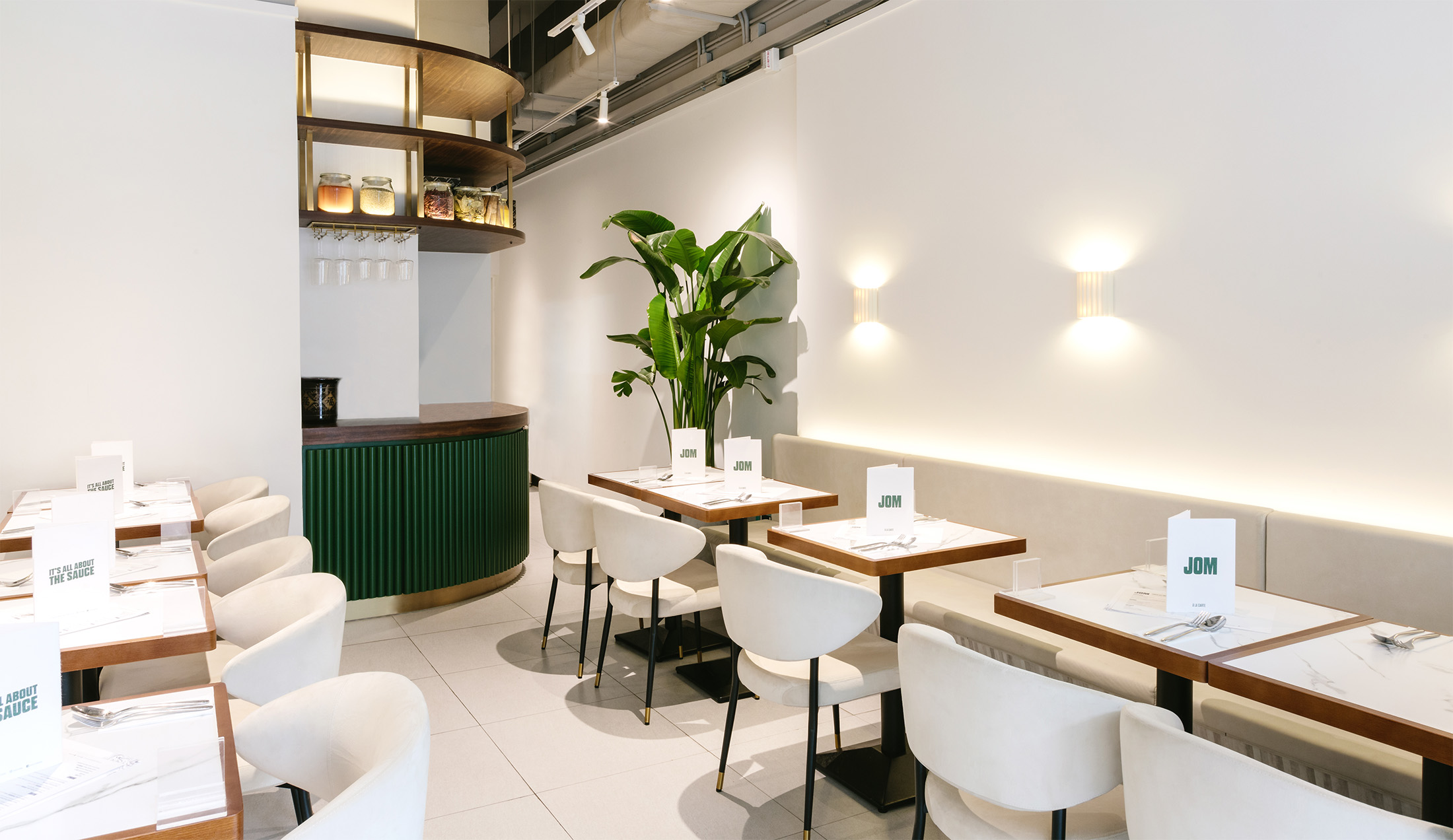
The restaurant’s minimalist interiors are designed to accentuate the vibrancy of the food. A blend of off-white seating, white stone marble tables, and dark wood accents creates a clean, modern atmosphere, subtly enhanced by touches of the primary brand green. This thoughtfully crafted ambience provides diners with a luxurious dining experience.

Response
Since its opening, JOM has received an incredible response, with numerous reviews and features praising its cuisine. The restaurant has been highlighted in Vogue, Time Out, and Tatler Asia. JOM's homemade sambal has become especially popular, often selling out due to high demand.


