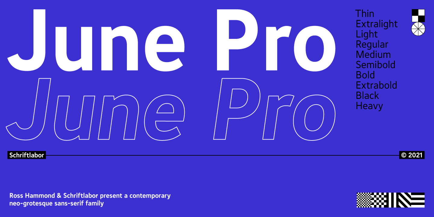
June Pro
Type Design
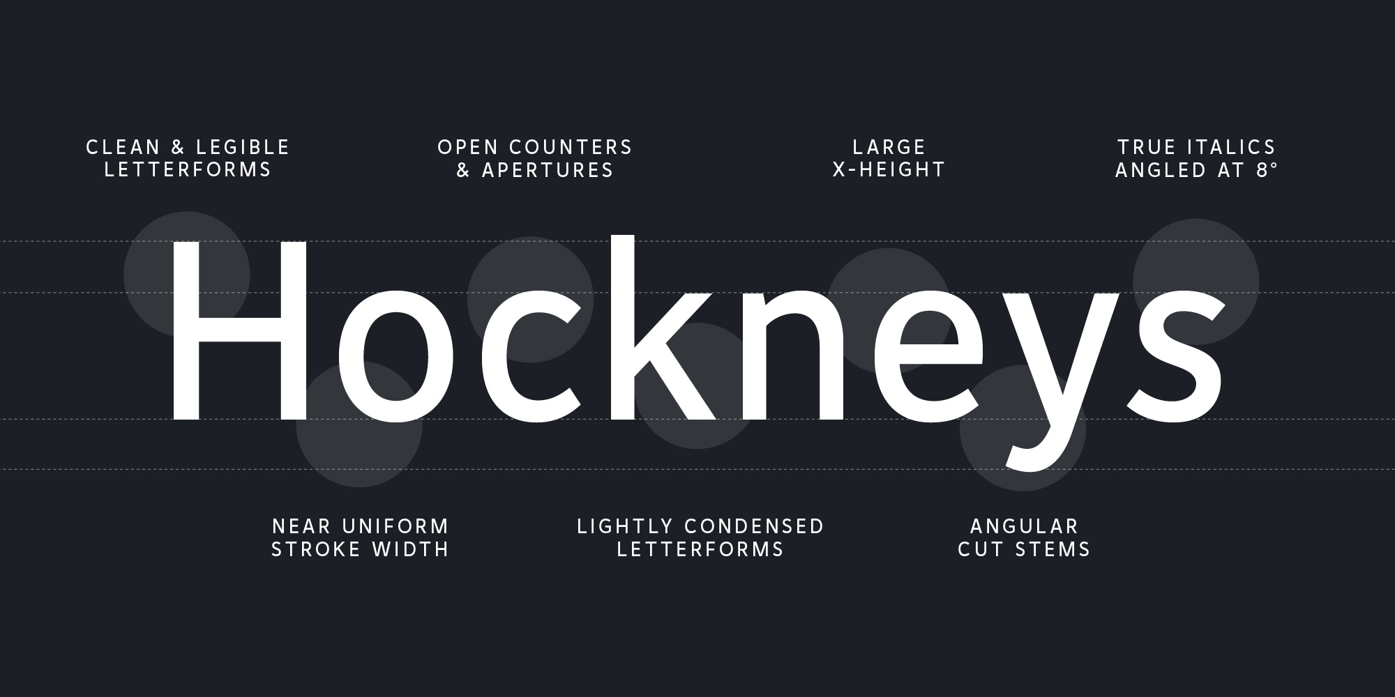
June Pro is a modern sans-serif family in 10 weights, ranging from Thin to Heavy with true italics and is inspired by the work of Adrian Frutiger. It is a versatile and distinctive typeface, making it perfect for various applications like editorial, web design or branding. June Pro is published by Schriftlabor, and is available on MyFonts, FontSpring & I Love Typography.

Legibility
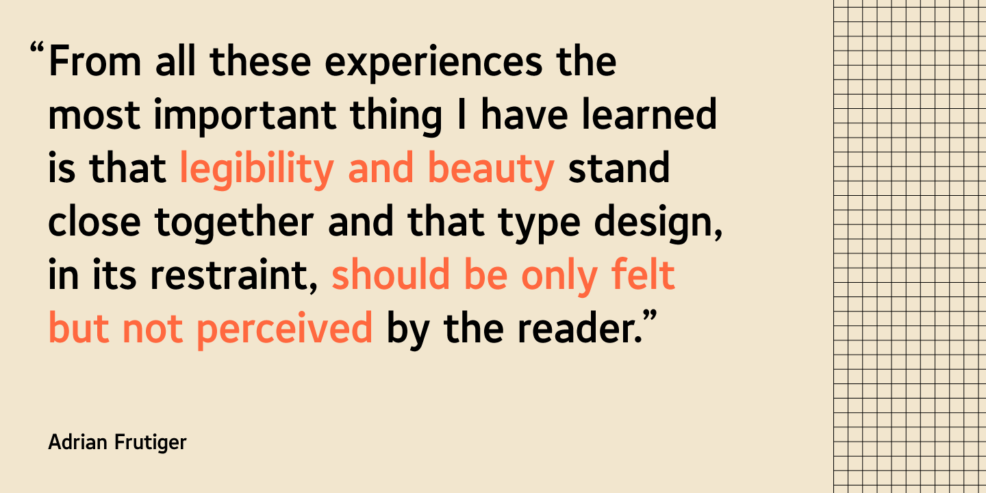
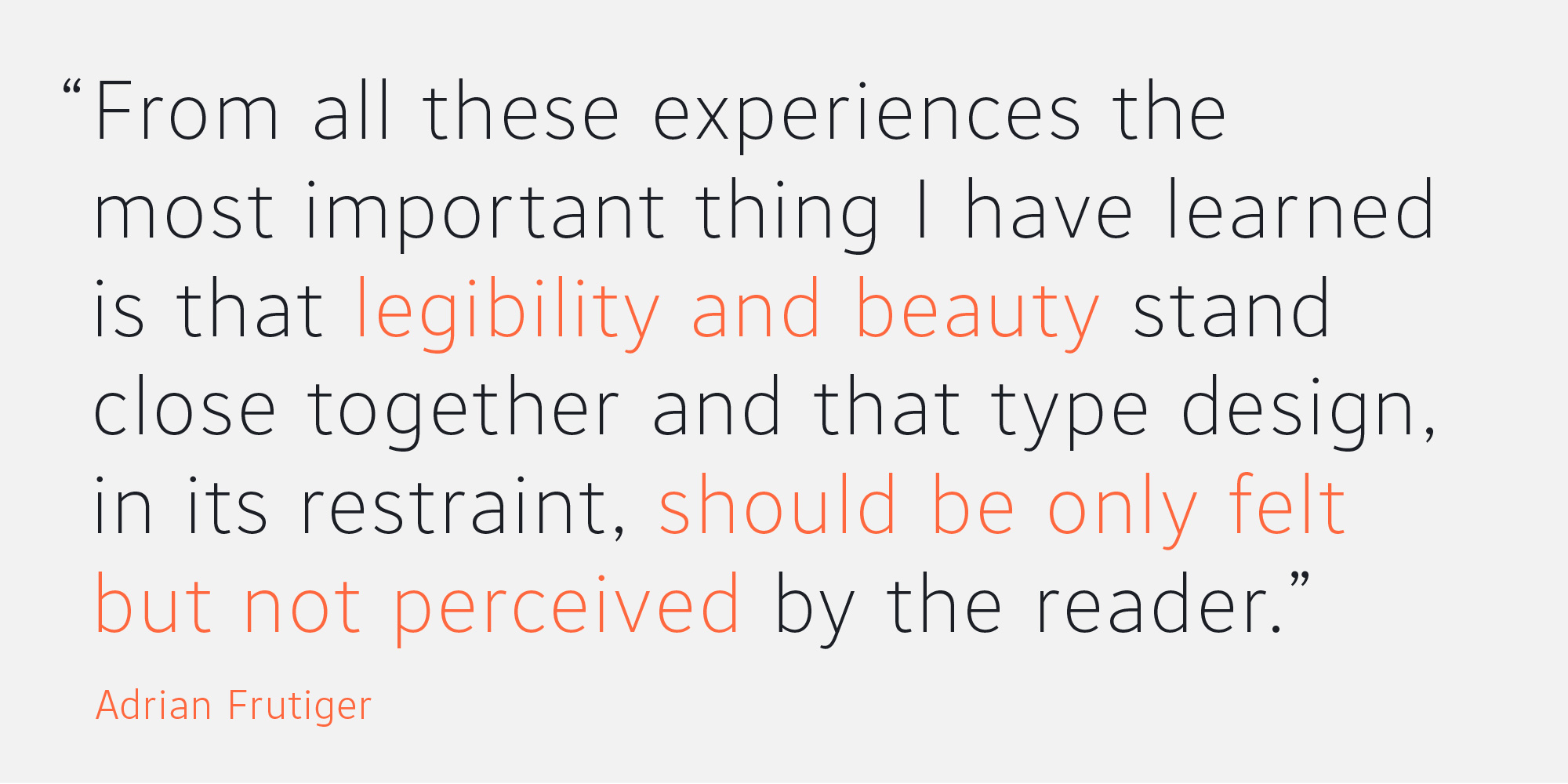
June Pro’s highly legible features are influenced by taking a contemporary approach to Adrian Frutiger’s exploration into type form and legibility. I completed a Masters in Type Design and studied the form of Adrian Frutiger’s Avenir, Frutiger, and Univers, which are regarded as some of the most legible typefaces of all time.
True Italics
June Pro’s italics are angled at eight degrees and are redesigned to provide a stylistic difference without reducing legibility. An eight degree italic is less than standard, and my research suggested an angle greater than this can reduce legibility.


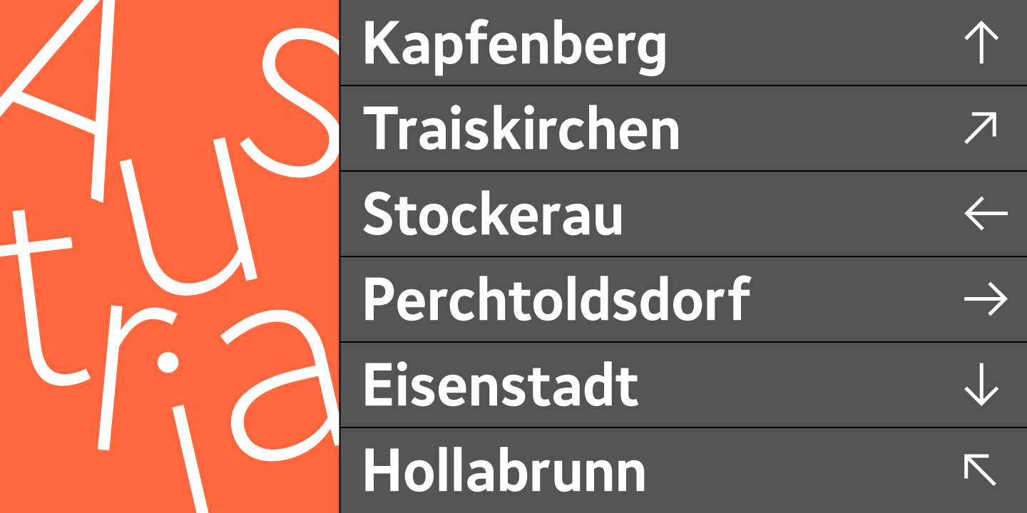
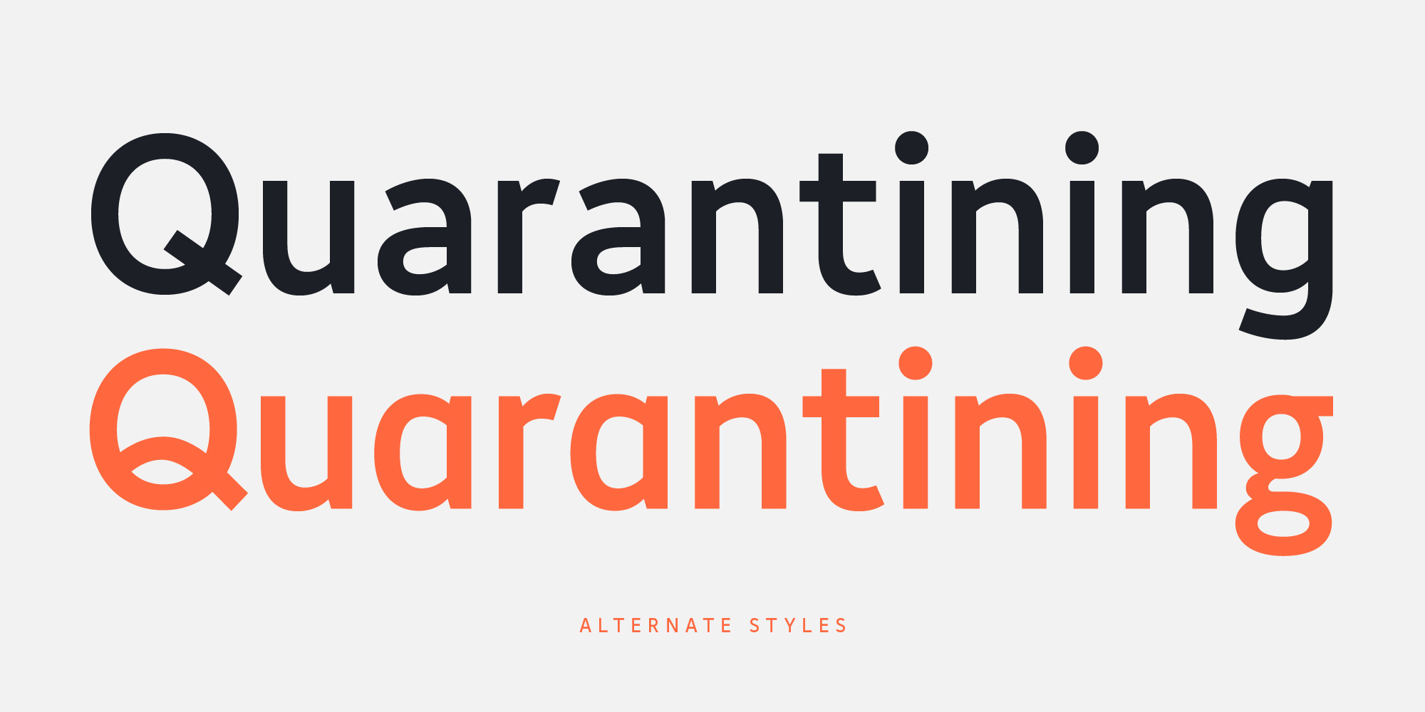
Alternate Styles
June Pro includes stylistic sets of several letters to give users a customisable experience of the typeface. Its distinctive alternate ‘Q’ can greatly aid legibility.

Languages
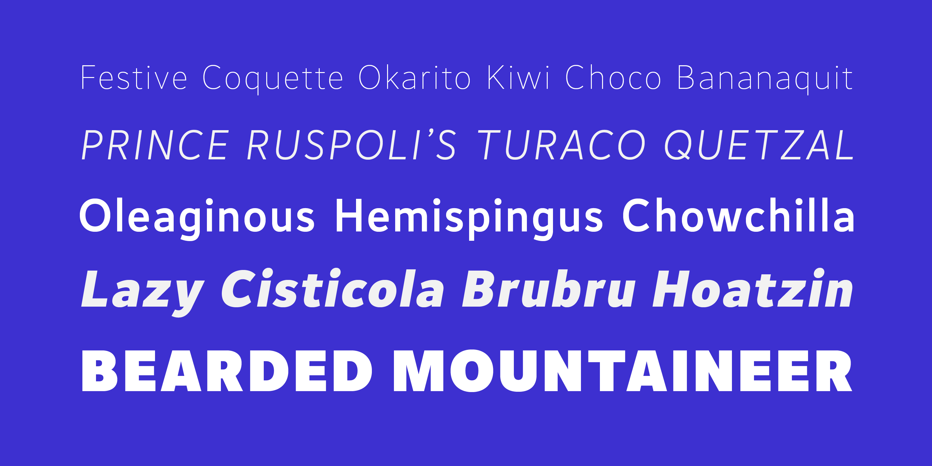
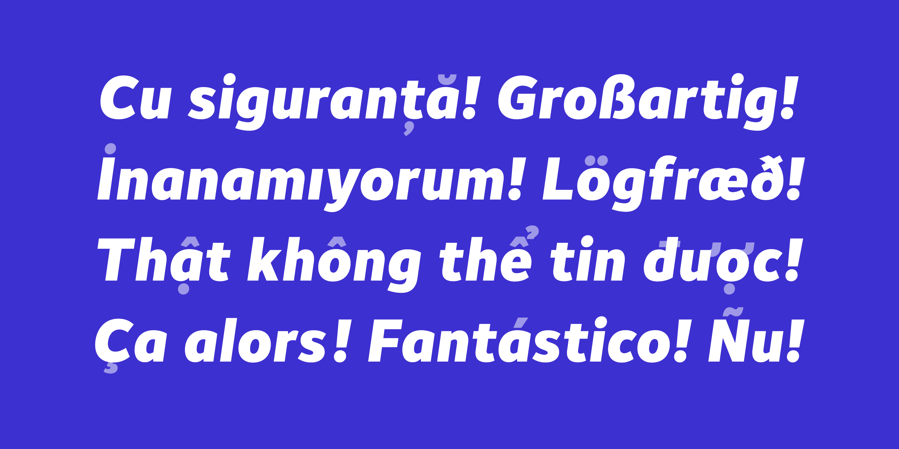
Each font weight has 607 glyphs, with multilingual support including Extended Latin, Western Europe, Central/Eastern Europe, Baltic, Romanian, Pinyin, Turkish, and Vietnamese.
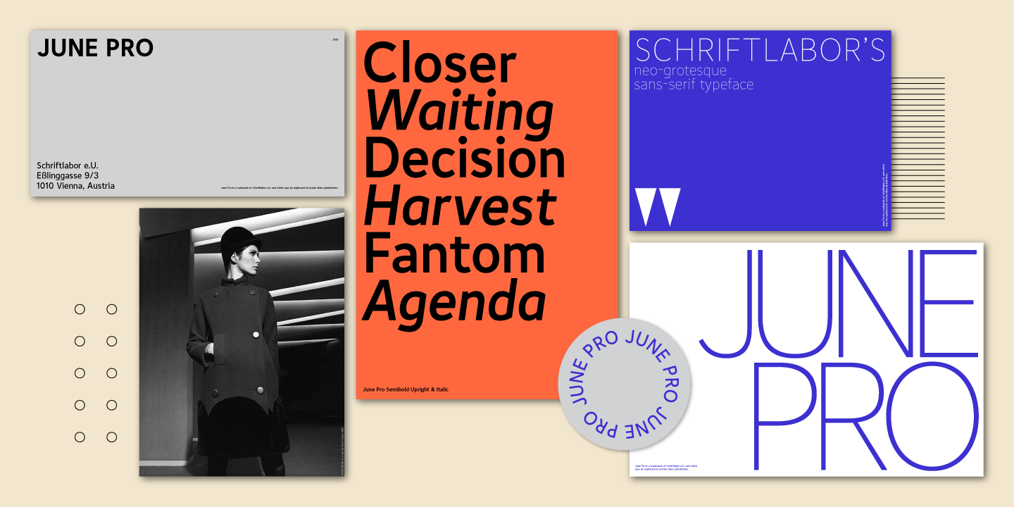
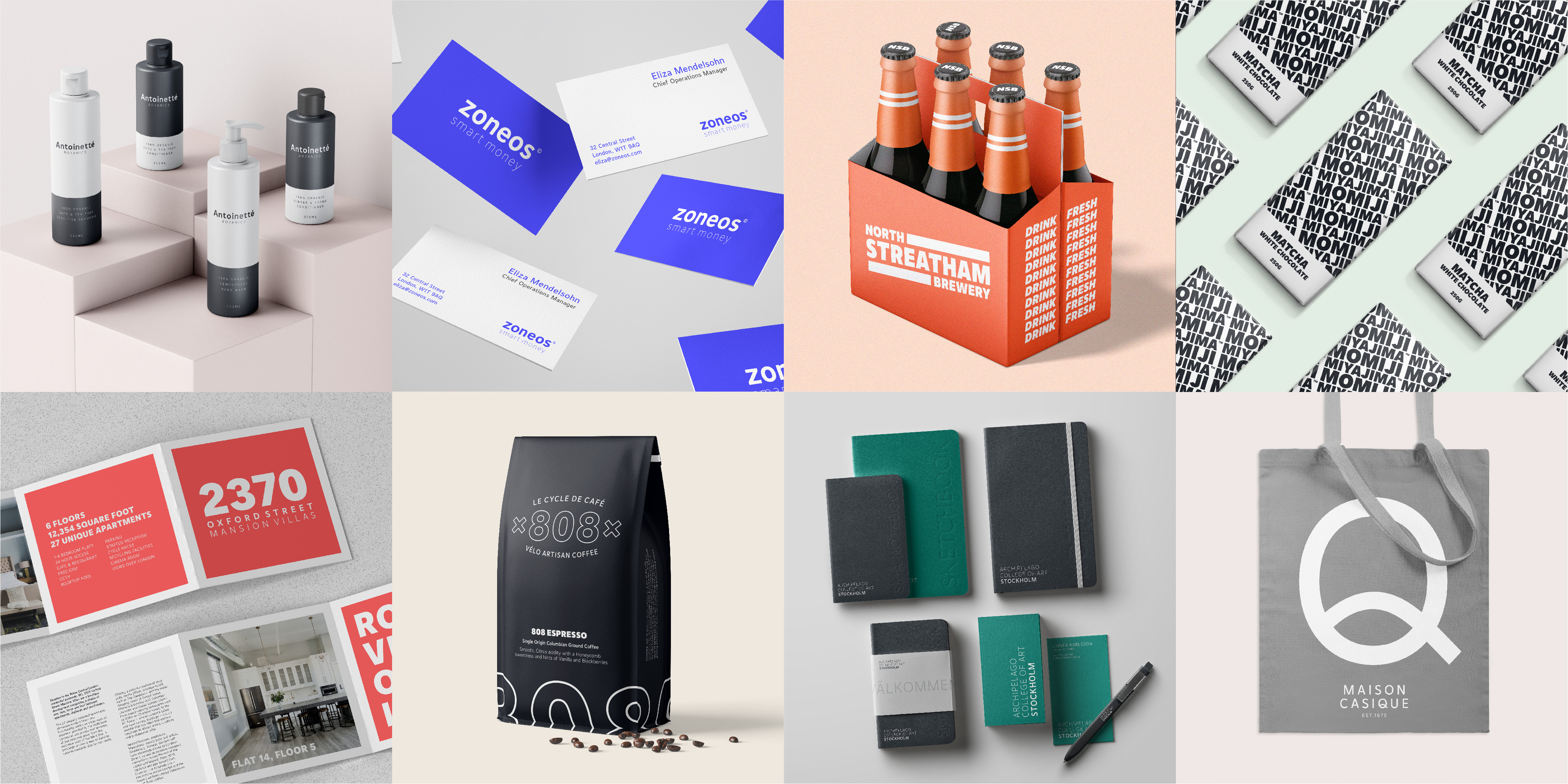
Brand Identities
To visualise June Pro’s distinctive and versatile characteristics, I designed nine brand identities using different font weights and styles. You can see more on these identities here.

Further Artworks
Working with Schriftlabor, a further range of artworks were designed to display June Pro for MyFonts, Fontspring and I Love Typography.