Team Sky
A brand refresh and kit design celebrating Team Sky’s final year and decade of success.
Team Sky needed a refreshed identity to mark its 10th anniversary and final year in the peloton.
The challenge was to create something that felt familiar to fans, distinctive in race conditions and worthy of the team’s decade of success, while bringing a renewed sense of purpose to the full visual system.
The work covered the complete Team Sky range, including rider kits, training kits, bikes, supporting vehicles and the tour bus, creating one cohesive look across the team’s final season.
Team Sky needed a refreshed identity to mark its 10th anniversary and final year in the peloton.
The challenge was to create something that felt familiar to fans, distinctive in race conditions and worthy of the team’s decade of success, while bringing a renewed sense of purpose to the full visual system.
The work covered the complete Team Sky range, including rider kits, training kits, bikes, supporting vehicles and the tour bus, creating one cohesive look across the team’s final season.
Role
Role
Design Lead
Agency
Agency
Antidote
Scope
Scope
Art Direction, Kit Design, Livery
Familiar, but sharper
Familiar, but sharper
Team Sky had built a strong visual identity around black, blue and the iconic line. The refresh needed to respect that equity rather than replace it.
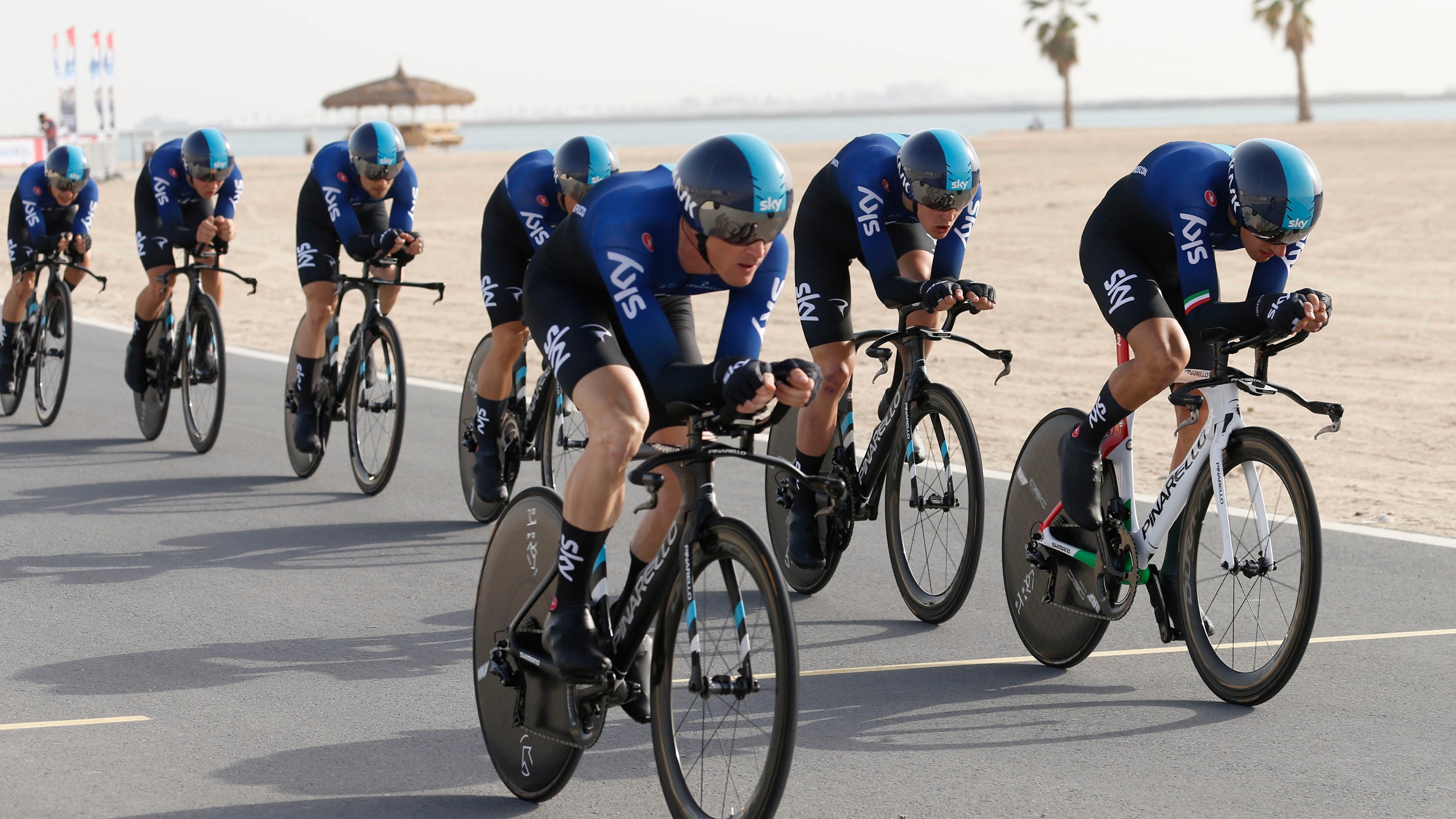
The new direction brought back the team’s signature black aesthetic, paired with an ocean blue gradient that connected to the Sky Ocean Rescue partnership. The blue line was retained on the back of the jersey, keeping a recognisable detail that had been part of the team’s identity for the past decade.
Rider names were moved from the back to the sides, creating a cleaner, more refined look while giving the kit a stronger presence from every angle.
Team Sky had built a strong visual identity around black, blue and the iconic line. The refresh needed to respect that equity rather than replace it.
The new direction brought back the team’s signature black aesthetic, paired with an ocean blue gradient that connected to the Sky Ocean Rescue partnership. The blue line was retained on the back of the jersey, keeping a recognisable detail that had been part of the team’s identity for the past decade.
Rider names were moved from the back to the sides, creating a cleaner, more refined look while giving the kit a stronger presence from every angle.


Designed for the peloton
The black and blue system gave Team Sky a fierce, purposeful look that stood apart from the busier, sponsor-heavy jerseys around it.
Across the jersey, bike and support vehicles, the ocean blue gradient created a sense of speed, movement and fluidity. On the bike, the radial gradient moved from deep blue at the centre into black at the edges, reinforcing the performance feel while keeping the design understated and premium.
The system was developed closely with Castelli to make sure colour, logo placement and material finish carried through from concept to production.
The black and blue system gave Team Sky a fierce, purposeful look that stood apart from the busier, sponsor-heavy jerseys around it.
Across the jersey, bike and support vehicles, the ocean blue gradient created a sense of speed, movement and fluidity. On the bike, the radial gradient moved from deep blue at the centre into black at the edges, reinforcing the performance feel while keeping the design understated and premium.
The system was developed closely with Castelli to make sure colour, logo placement and material finish carried through from concept to production.


A final-season identity
The refresh gave Team Sky a distinctive final-season look that celebrated the team’s legacy while still feeling modern, focused and race-ready.
The kit went on to win Cycling Weekly’s 'best kit of the year', giving the project a clear result beyond the visual refresh.
The refresh gave Team Sky a distinctive final-season look that celebrated the team’s legacy while still feeling modern, focused and race-ready.
The kit went on to win Cycling Weekly’s 'best kit of the year', giving the project a clear result beyond the visual refresh.


Related projects

Get in touch
© 2026 Ross Hammond
Get in touch
© 2026 Ross Hammond
Get in touch
© 2026 Ross Hammond